If you're an AI power user and you don't have a token dashboard, you're flying blind.
Thirty days ago I started seeing posts about a dashboard that people were saying you couldn't live without.
I gave it a go.
And boy, am I glad I did.
I was pretty much blown away by the numbers I was seeing.
That sounds impossible.
It isn't.
Here's the math.
A "turn" in Claude Code is one round trip: I send a message, Claude responds (sometimes with several tool calls in the middle, but it counts as one turn).
Every single turn, Claude re-sends the entire conversation context to itself.
The whole conversation.
Every file it has read.
Every tool result.
All of it.
That re-send is what "cache read" means.
The context is cached, Claude already paid to put it there once, and now every turn pulls it back out.
Cache reads cost roughly ten times less than fresh input tokens, but they still count, and they pile up fast.
I run sessions in Opus on the one-million-token context window.
So a long session might re-send 700 thousand tokens of context every turn, for 150 turns, before I close it.
That's about 100 million cache reads in a single session.
I had 282 sessions in 30 days.
The math works out to 5.6 billion exactly the way it should.
5,600,000,000 cache reads ÷ 41,481 turns = about 135,000 cache reads per turn on average.
For an Opus session with a 1M context window, 135K is a modest read.
The number stops looking impossible the moment you remember that every keystroke I send re-loads the whole conversation.
I'm on the Max-20x plan with Anthropic, $200 a month flat.
The dashboard estimates that the same usage on the API would have run me roughly twelve thousand five hundred dollars.
So I'm not bleeding cash.
What I'm bleeding is quota: the rate limits and the weekly cap.
That's what the numbers actually let me see.
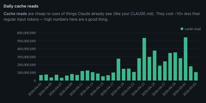
The chart told me when my work changed
Look at the chart.
The first three weeks of April are quiet, somewhere around 75 million cache reads a day, give or take.
Then April 23 happens and the bar shoots up to 535 million.
After that I never come back down.
Sustained 200 to 400 million a day, every day, for the rest of the month.
April 23 was when I dove in on the My Projects page for this site.
I wanted a way to showcase the projects I'd been working on, rather than putting them on a piece of paper and saying "trust me, I did it."
So I started building out the explainer pages: the Recipe App showcase, the audio walkthrough for the OnTrak Call Guide, the Friends Job Dashboard, the Entertainment Hub, the Visual Prompt Builder.
Each one a deep page with screenshots, narration, and the story of why the project exists.
I also added audio to all of my pages and blog posts.
This kind of work means opening the same files over and over, iterating the same images, refining the same paragraphs.
I was working on several projects at one time with terminal windows open for each of them.
I was hyper-focused.
I really had my foot on the gas.
The dashboard tells the story.
I couldn't have told you that without this chart.
I'd have said "the second half of April was busy."
The chart says exactly when busy started, and exactly what kind of busy it was.
Then the dashboard read my mind
The Tips page is what hooked me.
It isn't just data, it's prescriptions.
I use this page now as a way to spot opportunities to streamline.
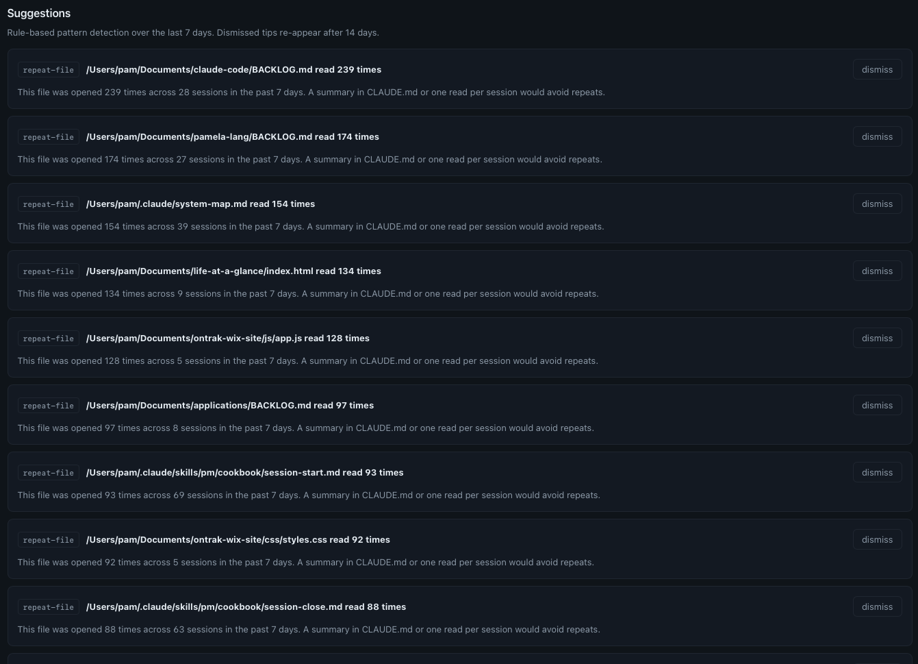
Click to enlarge.
Here's a sample of what it told me about the last seven days:
- claude-code/BACKLOG.md read 239 times across 28 sessions: A summary in CLAUDE.md or one read per session would avoid repeats.
- pamela-lang/BACKLOG.md read 174 times across 27 sessions: Same suggestion.
- system-map.md read 154 times across 39 sessions: Same.
- life-at-a-glance/index.html read 134 times across 9 sessions: That's about fifteen reads per session. The file is large. Either it should be split, or only the relevant section should be opened.
- PM cookbook session-start.md read 93 times across 69 sessions: One read per session, and then some. Predictable, maybe gettable from cache.
- PM cookbook session-close.md read 88 times across 63 sessions: Also basically one per session.
I wouldn't have known any of this without the dashboard.
Every single one of these is a chance to streamline.
The right-sizing suggestion
This is pure gold:
The dashboard is doing math I would never do.
Looking at every Opus turn under 500 output tokens, the small stuff, the quick edits, the one-line answers, and asking: did this really need Opus?
For me, on Max-20x, that $241 of theoretical weekly savings isn't a literal refund.
I pay $200 a month flat.
But what it does tell me is how much of my weekly quota I'm burning on work that didn't need the heavy model.
And the weekly quota is a real wall.
So I tried switching.
I started opening sessions in Sonnet, planning to escalate to Opus only when I hit something Sonnet couldn't handle.
That worked for about two weeks.
Then they dropped the Sonnet context window down to 200K versus 1 million, forcing us all to use Opus if we wanted the 1 million context window, and my workflow rebalanced again.
Here's the actual move I settled on: I open every session in Sonnet, run my /pm briefing in Sonnet because that routine burns through small focused turns, then I switch to Opus for the long context iterative work.
This rework was the result of just one of the tips from this new dashboard.
Look at your own data
If you use Claude Code daily and you haven't measured your own usage, you're flying blind.
I didn't build this. github.com/nateherkai/token-dashboard by nateherkai did.
I downloaded it, ran it, and it changed how I think about my own usage.
It reads the local SQLite file Claude Code writes automatically.
No API integrations to build.
No data to export.
The file is already on your machine.
The dashboard just reads it.
What you actually want to look at:
- Daily cache reads, so you can see when the character of your work changed
- Tokens by project, so you know where your time actually went
- Token usage by model, so you can see your Opus-vs-Sonnet split
- The Tips page: repeat-file patterns, repeat-bash patterns, right-sizing suggestions
Once you have that data, you make different decisions, because the numbers show you where your actual working patterns are versus where you assumed they were.
What the numbers led me to build
When I saw my own data clearly, I didn't just note it and move on.
I built a decision framework from it.
When does Opus actually earn its context window?
When does Sonnet give me the same outcome for a fraction of the run?
When is a session about to hit the wall, and how do I see that coming?
That framework is the next post in this series.
But it started with the dashboard.
You can't build a real decision framework from a feeling.
You build it from thirty days of your own data.
If you're using Claude Code seriously, I highly recommend this dashboard.
The numbers will surprise you.